.png)
Types of Dashboard Widgets
Widgets are the cards of information, and the combination of specific widgets becomes a Dashboard. All of the widgets follow a similar structure (even if the data delivery is different).
|  |
The different types of widgets fall into three main categories:
Total Values
Charts and Graphs
Tables
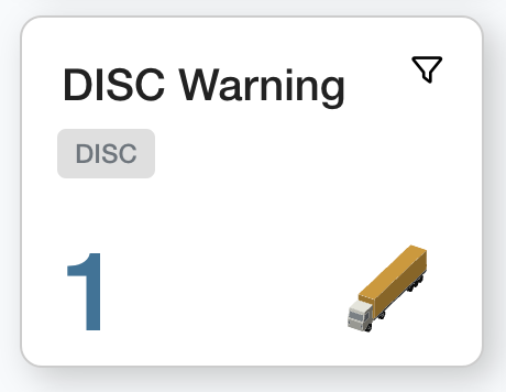
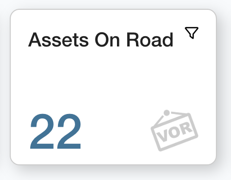
Total Values
The total value widgets give an exact total of a condition. They are helpful in gaining summaries of your fleet at a glance.
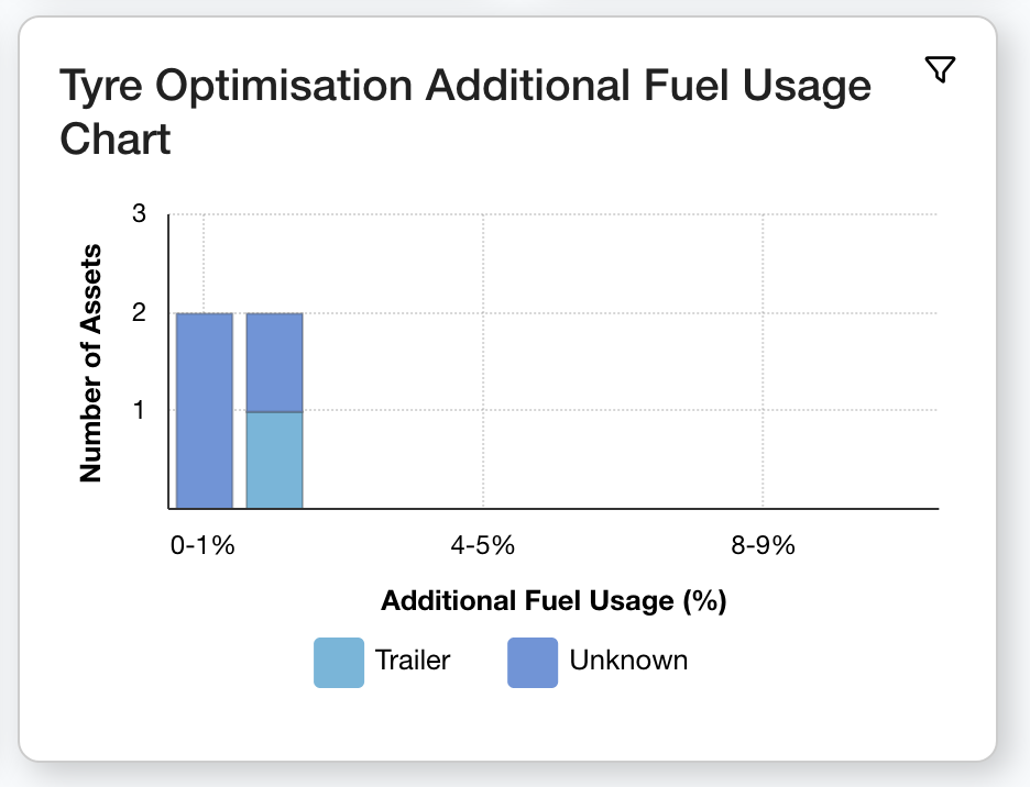
Charts and Graphs
Graph widgets are great for quick data analysis and comparison. The main graphs used for the widgets are pie charts, bar charts and stacked bar charts.
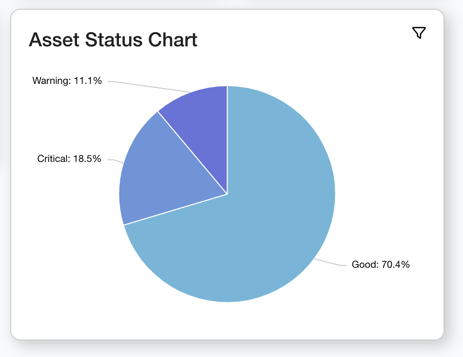 | 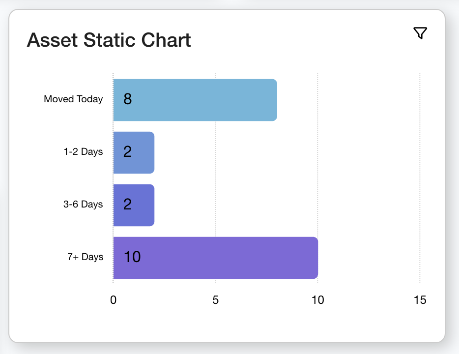 |  |
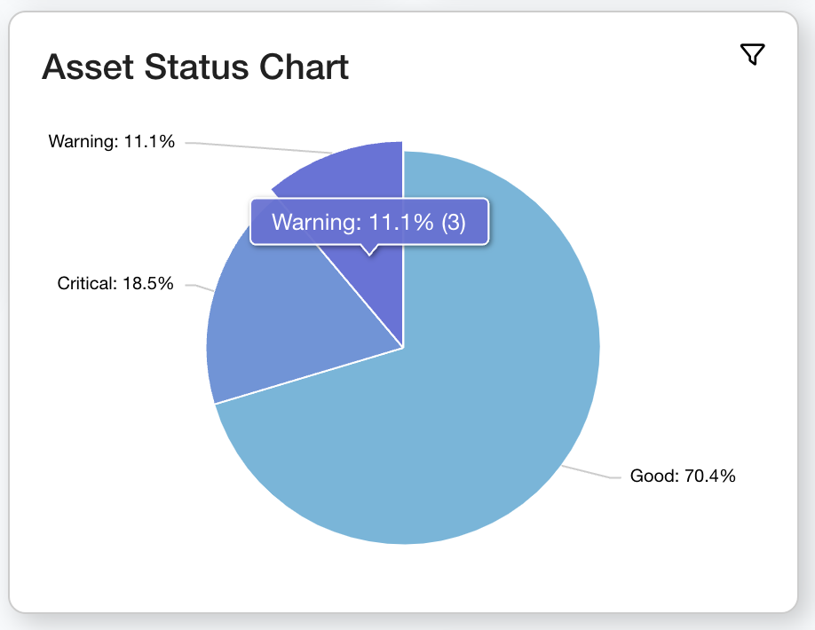 | On particular charts you can hover over the plotted data to see more information. |
 Clicking the ‘Warning’ slice shown above will open this breakdown. | You can also click into the slice or bar on a chart to view a breakdown of the assets which make up that statistic. |
Tables
Table widgets are great for showing which specific assets meet certain criteria; allowing you to see exactly which assets are included in statistics.
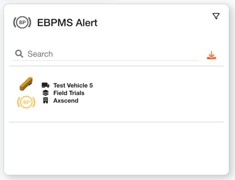 | The table consists of rows - each row being a new asset. Clicking on an Asset Row will redirect you to its The Asset Dashboard page. |
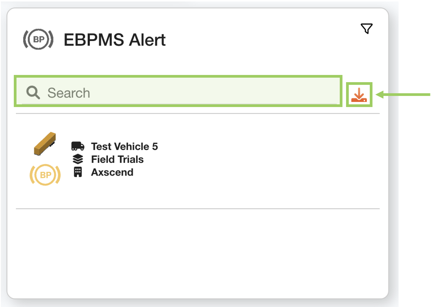 | The search bar can help you find specific assets from the data set. The export button downloads a CSV file of the assets included in the table, creating an on-demand minature report. |
 Troubleshooting
For any issues or errors that have not been solved please Contact Axscend Support.