.png)
Editing a Dashboard For Different Screens
The responsive dashboard is still undergoing some development, and you may seen improvements to this feature in the future.
If you are a mobile Portal user, your Dashboard may not be optimised for smaller screens. The responsive dashboard allows you to edit the layout for different screen sizes, so your dashboard is always looking its best on any device.
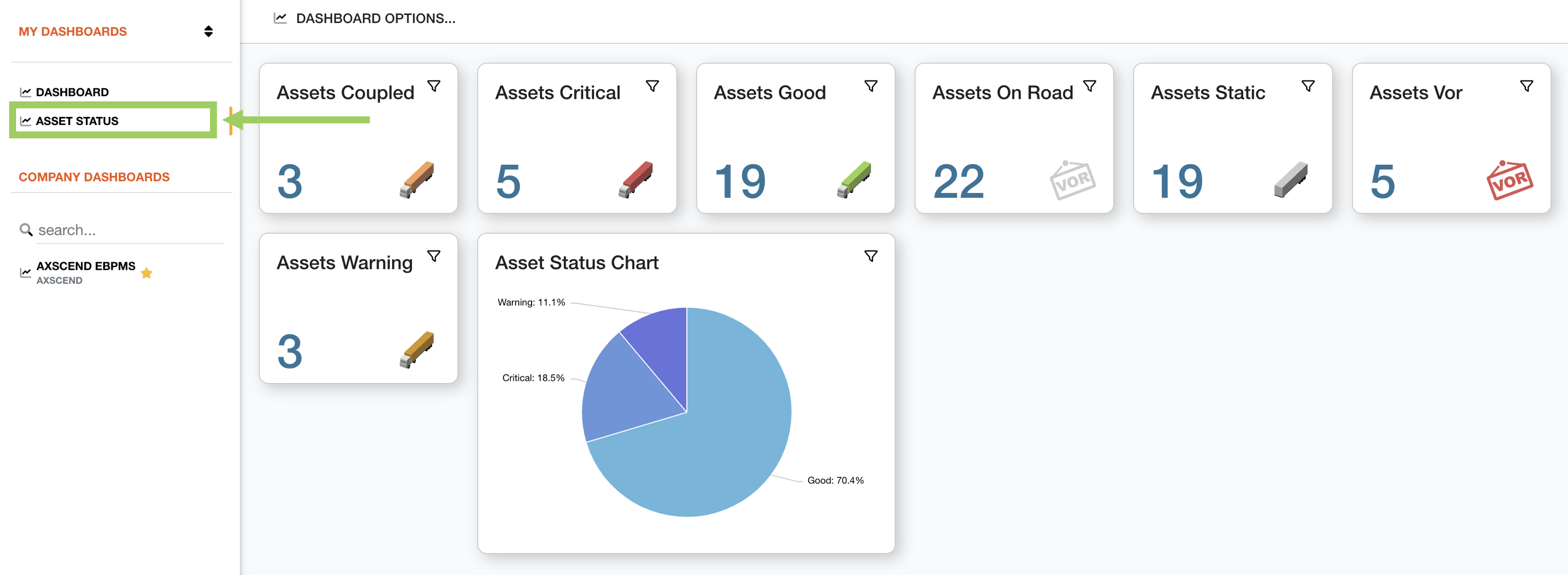
To edit the layout for different screen sizes, ensure you are on the Dashboard page.
Using the left sidebar, select the dashboard you want to edit. This will open the dashboard in the main content area.
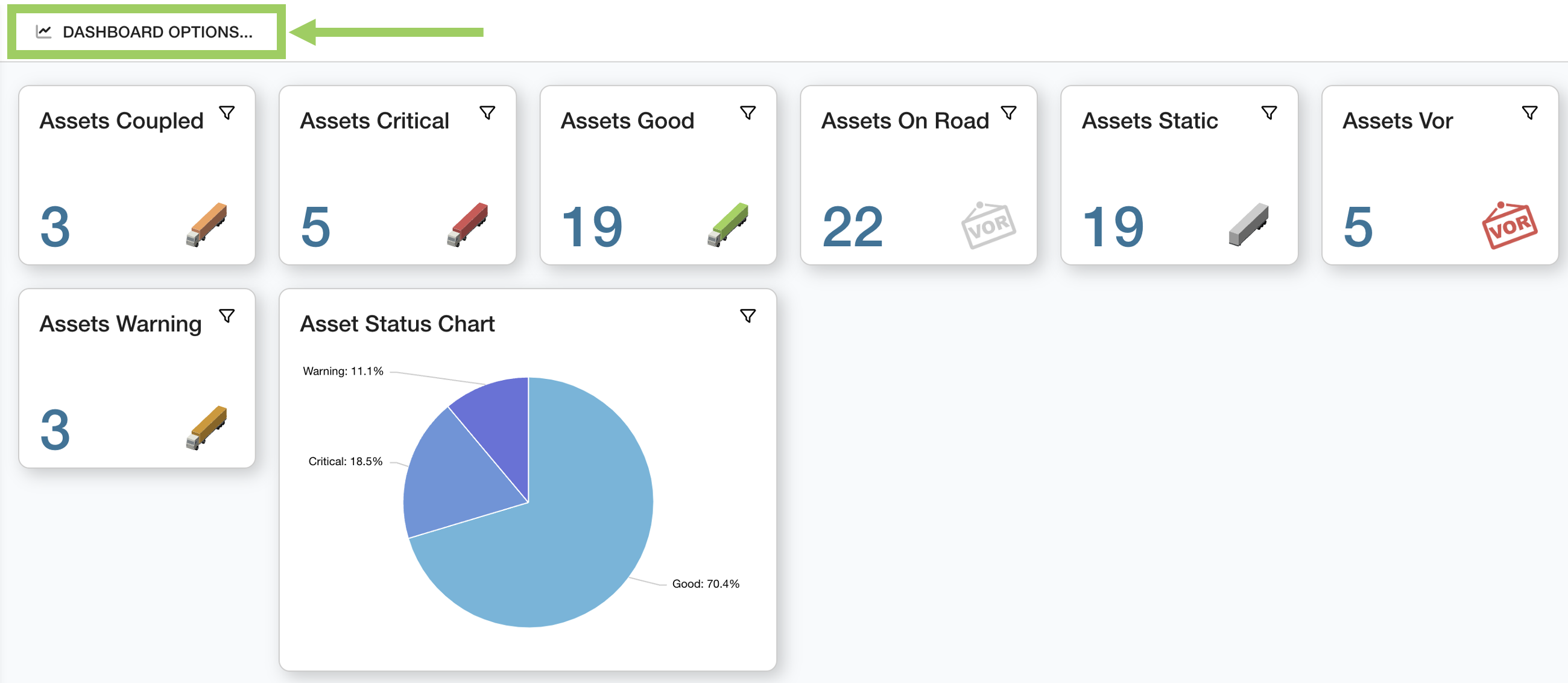
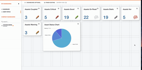
Above the dashboard, click on the ‘Dashboard Options’ button to open the options menu.
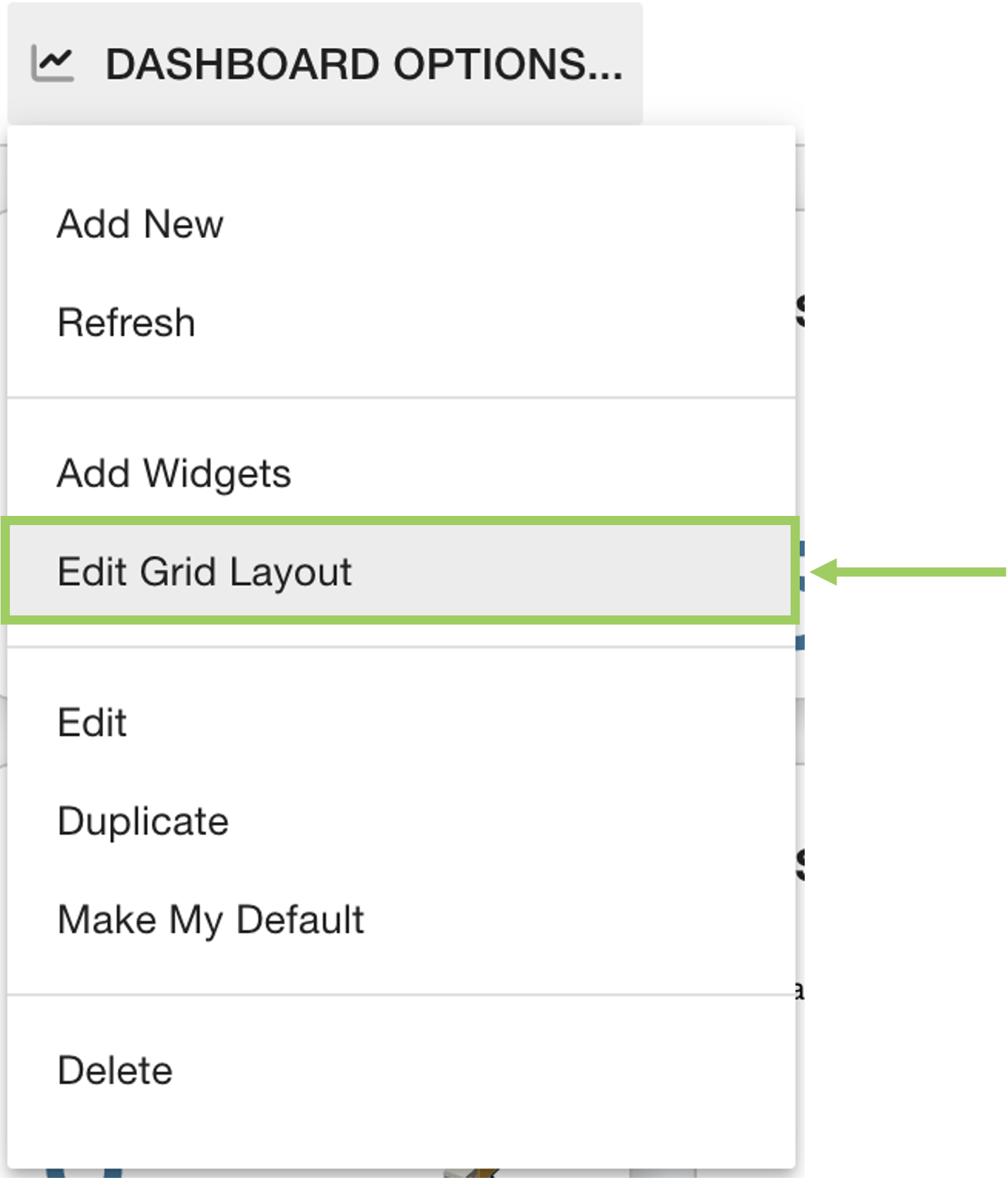 | Click on the ‘Edit Grid Layout' button |
This will enter the Grid Editor mode, where you can see the structure of the dashboard as a grid. The widgets are positioned on the grid and take up a set amount of squares in space.
On the toolbar, the window size is displayed.
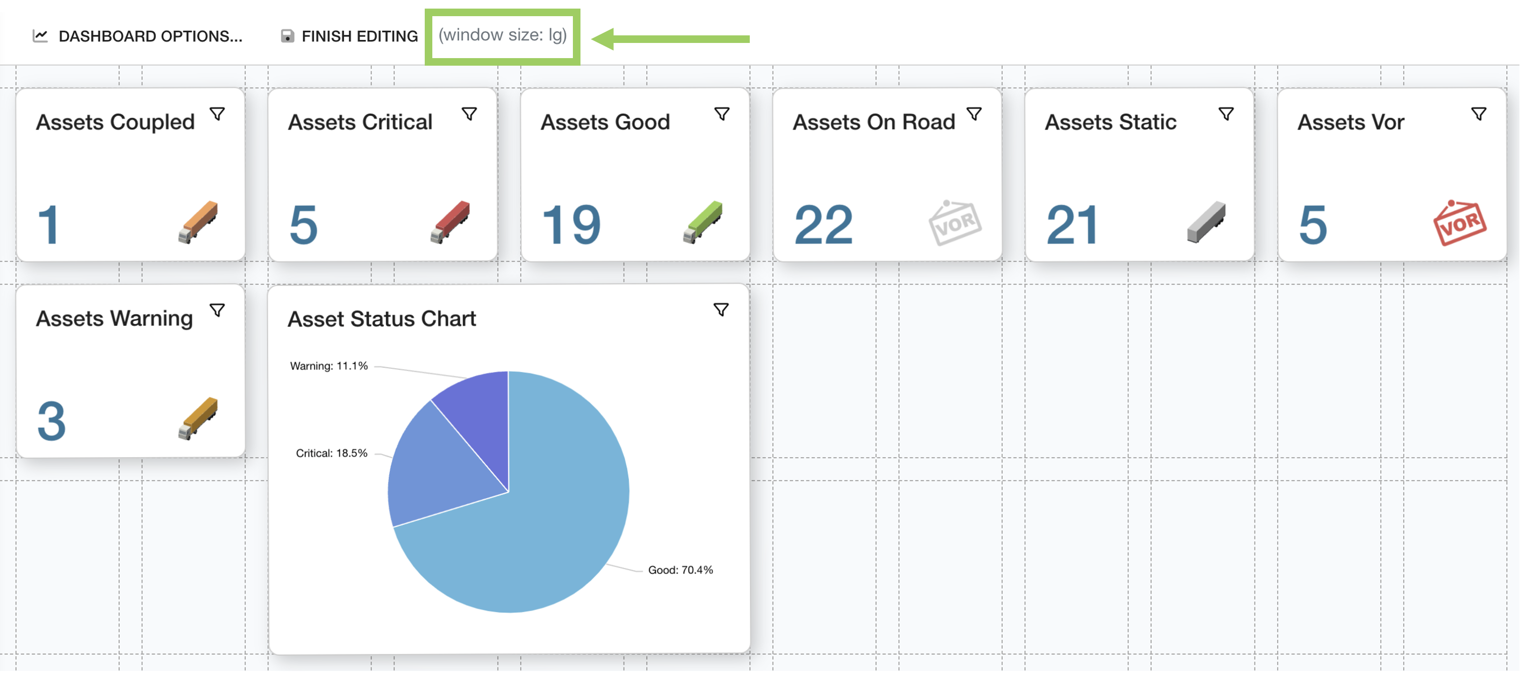
You can decrease the size of your browser screen to simulate smaller screens; as you make the screen smaller you can see the window size value changes.
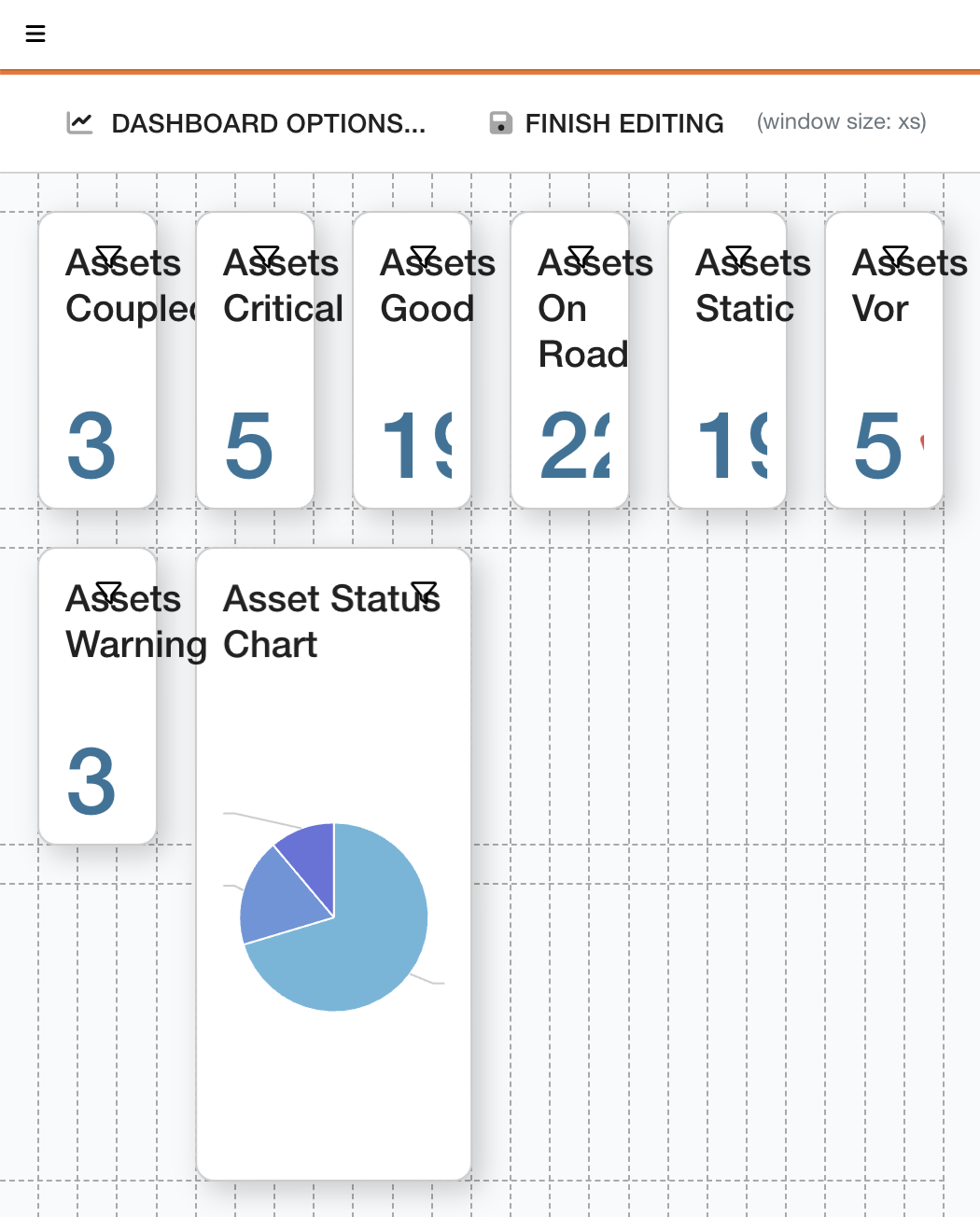 | To edit the dashboard for an xs screen (suitable for most mobile devices), decrease your browser window until the window size reads XS. This will emulate the mobile view of your dashboard. |
Move and resize the widgets to fit the new screen size.
Move the widgets on the page by clicking and holding the widget you want to move. Once your cursor changes, you can start dragging the widget to a new location.
Change the size of the widget by positioning your cursor along either the side or the corner of the border of the widget. Once your cursor has turned into an arrow, click and hold the side/corner, and drag away to increase the size, or drag inside the widget to decrease the size.
If you need more grid space, drag the widget down off the grid. This will add another row of squares onto the grid.
For more support editing widgets on the grid layout, see Editing a Dashboard Grid Layout.
Once your layout has been adjusted for mobile view, click ‘Finished Editing’.
This will save the new layout for the window size displayed in the toolbar. Therefore, when your browser is at its normal size again you might not see this layout anymore.
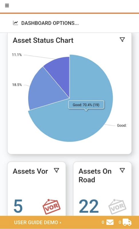 Shows the Responsive Dashboard being used on a mobile device. | The dashboard should now be more optimised for mobile view, without affecting your normal desktop experience. |
 Troubleshooting
For any issues or errors that have not been solved please Contact Axscend Support.